Everything-You-Need-To-Know-About-Ink-And-Environmentally-Friendly-Printing-5c4b21c75341e-1200x563.jpg

How to Design an Effective Brochure – Part I

Whether your business is attending a trade show or if you’re wanting to create marketing materials to have on hand at your office, brochures are a great way to provide information to potential clients or customers in an easy and accessible way. The hard part, however, is designing a brochure that grabs people’s attention and displays the information in a way that is easy to read. A well designed, and well written, brochure will make it easy for readers to quickly understand your business’s message.

House of Printing provides the Burtonsville, Washington, and Baltimore areas with high-quality print materials. Even though we can’t help you write the content of the brochure itself, we can help make sure that the design and the print quality is spot-on.

Here are some tips to designing an effective brochure.

House-of-Printing-CTA-5bfc04d8449ca.jpg

What is Your Objective?

Why are you creating a brochure? What is the purpose of the brochure? It is simply providing cost information about your products? Is it telling the history of your business? Is it for a specific event? The more information you can gather about the why behind the brochure, the easier it will be to determine the appropriate layout. Keep in mind that the content and the design is directly communicating with the audience.

Who is Your Audience?

If your audience is young professionals, the design will be much different than if your audience is senior citizens. When you have narrowed down who the target audience is, you can narrow down the overall concept of the brochure. Young audience? Keep it simple, modern, and clean. Older audience? Keep it classic, neutral, and uniform.

dreamstime-xxl-35953473-5c4764e2c35c8.jpg

Think Outside the Box

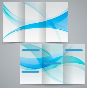
The typical brochure is a simple tri-fold design that can easily be read from left to right and top to bottom. But if you want to engage your reader, there aren’t any limitations to how the brochure is arranged, for both the content and the graphics. Consider starting the design on a large piece of paper that isn’t in the standard brochure size and then make the design fit the size, rather than making the size fit the design.

Consider the Font

Do you have six different fonts that you can’t decide which to use? If your initial reaction is to use all of them – don’t. Just don’t. Font is a subject all it’s own, so we’ll leave that to another post, but when it comes to the size, shape, and texture of the letters, keep it simple. If you have to use more than one font, limit to two.

Keep it Straightforward

Unless the brochure is entirely informational (the history of your company, for example), limit the number of words that are used. Information should be in short, quick chunks, sometimes less than 50 words. Use short headers (less than 10 words) to draw attention to different points. Too much text will quickly turn the reader off and cause them to put the brochure down.

Create a Call-to-Action

This goes back to what the purpose of the brochure is. If you want to have the reader sign up for a class, purchase tickets, buy a product, go to an event, call for more information – make that purpose clear. An effective brochure will create a sense of action for the reader, and hopefully that action will be to the benefit of your company.

This is just the beginning of how to design an effective brochure. Check back soon for more tips.

If you have a design that you need printed, get in touch with House of Printing today. Our print shop team not only understands effective design, but also how to make the digital version into a beautiful, high-quality reality.

Call today to get your project started