Script
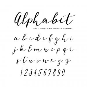
These fonts are also referenced as the cursive fonts. They are commonly used with brands that are looking for a more feminine, creative, or elegant appeal. While this may be a great logo font or the style for a company name, use this infrequently. Having a website or even an entire business card with this type of font throughout is not a good idea. When script is used in a paragraph form, it’s less likely that people will be able to read it with ease.
Serif
Serif fonts are known to be a bit more classic, or traditional in their style. The font is generally used to show strength in confidence, authority, and overall reliability. Some of the font style names are Egyptian Slate, Memphis, Georgia, and Archer. These options can be great for a business that is straightforward and traditional in their style. The fonts have what are often called little “feet”, which is what gives it the traditional feel affiliated with the font style.
Novelty
These fonts are unique and quirky. For business that are looking to catch eyes and be a loud contrast to generic fonts, these could be considered. While they may be fun and unique, it’s important to use these fonts sparingly and individually. Pair these font headers or titles with a more basic, classic font to balance it out and make it easier to read.
Sans Serif
Unlike their cousin, the serif font, this font does not have the “feet.” Instead, these fonts are clean cut and generally have a more modern aesthetic to them. This is a great option if you are looking for a simple, easy to read font for your brand, website and business cards. Many large companies use sans serif in their logos, such as Facebook and YouTube. Also known for its versatility, sans serif is a great option for reading in smaller print (such as a flyer or business card).


